OpenTelemetry Visualization: Benefits & Best Practices
Explore the power of OpenTelemetry visualization. Learn how charts and graphs can simplify monitoring, boost insights, and improve decision-making.
It’s a cliché to say a picture is worth a thousand words, but it’s not wrong – and it’s certainly true in the case of OpenTelemetry. The ability to produce visualizations for the logs, metrics, and traces that OpenTelemetry generates can play a critical role in helping teams make sense of all the data. By extension, OpenTelemetry visualizations allow engineers to leverage monitoring and observability insights more effectively. Rather than merely collecting telemetry data, they are empowered by visualizations to act on it.
That said, making and working with OpenTelemetry visualizations is not always easy, and the process has its limitations. For guidance on when to take advantage of visualizations as part of an OpenTelemetry-based observability strategy, along with tips on how to choose and use OpenTelemetry visualization tools, keep reading as we explain everything you need to know about the role that visualizations play in OpenTelemetry.
What is OpenTelemetry visualization?

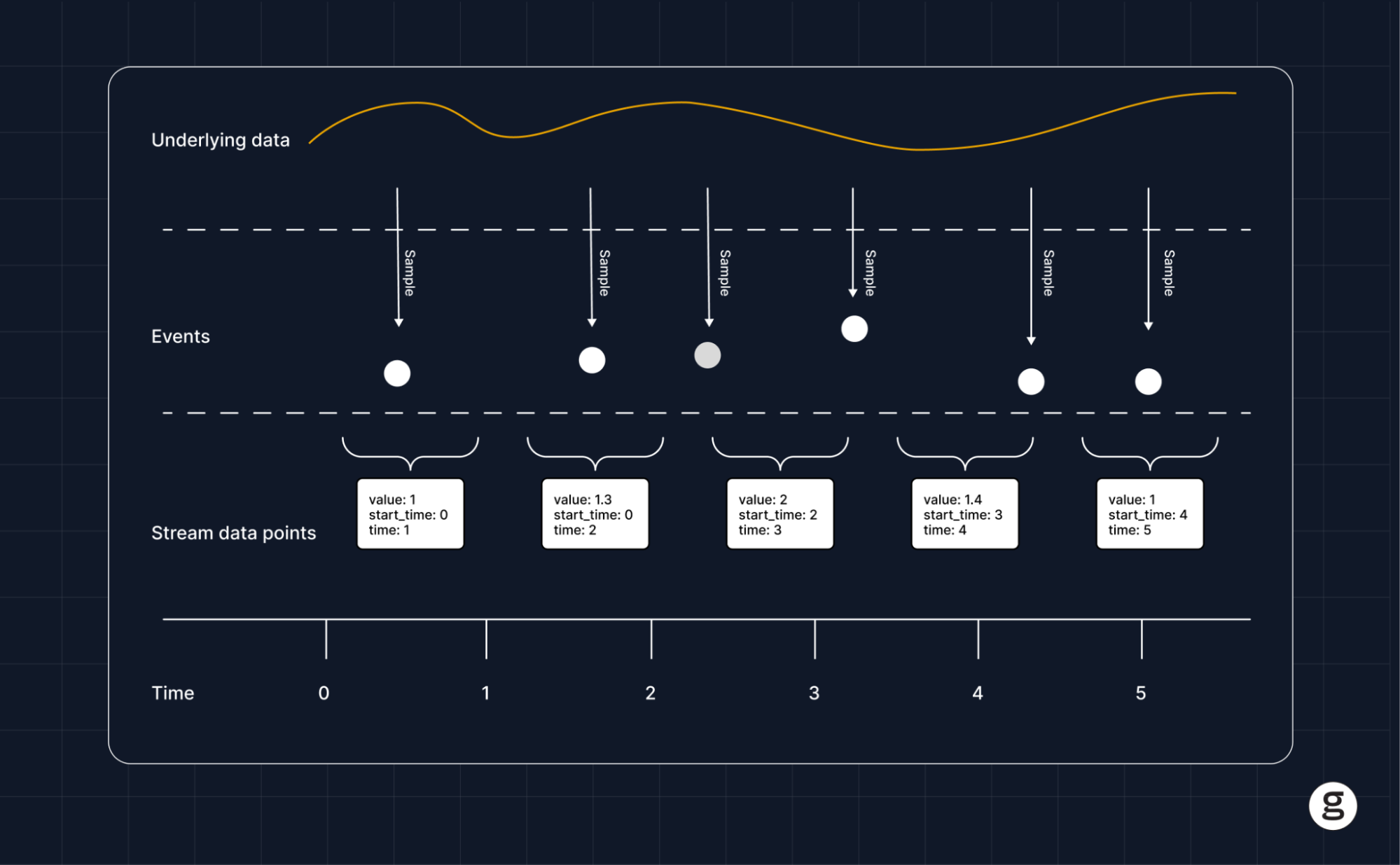
OpenTelemetry visualization is the practice of creating visual representations – such as graphs or charts – for telemetry data collected via the OpenTelemetry, the open source observability framework. The purpose of visualizations is to make it easier for humans to interpret the data and identify relevant trends and anomalies.
It’s important to note that OpenTelemetry itself is not a visualization tool. It’s an open source observability framework for collecting OpenTelemetry metrics, traces, and logs in a standardized way that facilitates the sharing of data between different OpenTelemetry-compatible systems.
However, using external visualization tools, you can display data from OpenTelemetry in a graphical form. This is what OpenTelemetry visualization means.
Why OpenTelemetry visualization matters
Visualizing data collected via OpenTelemetry is important because the data that OpenTelemetry collectors produce is often large in volume and complex in nature. As a result, it can be quite challenging to interpret the data by looking at the information in its raw form.
For example, if you use OpenTelemetry to collect log files from a Kubernetes environment, you might end up with hundreds of log files, each of which contains hundreds or thousands of individual log entries. Sorting through that telemetry data by hand to try to find important events, like container failures or resource utilization anomalies, would take a very long time.
You could, of course, use various log analysis tools to help interpret the data in textual form. For instance, you could use a simple tool like grep to parse the logs for events that mention an error. But that would still require a lot of manual effort, and depending on which terms you search for, it might not catch all relevant events. It’s also hard to identify overall trends – as opposed to specific outlier events – using this approach.
Visualizations in OpenTelemetry help to solve this problem by making it possible to transform thousands of individual log events, metrics data points, and/or information from distributed tracing into visual displays. Those displays can summarize overall trends – such as how CPU or memory utilization by a container varies over time. They can also highlight outliers or anomalies that could reflect an error; for example, if you created a chart showing the average startup time of containers, you’d easily be able to notice buggy containers whose startup time takes substantially longer because the points on your chart for those containers would be far removed from the cluster of points representing “normal” containers.
How to visualize OpenTelemetry data in simple steps
The process for visualizing OpenTelemetry data varies depending on which types of data you want to display, which types of visualizations you want to create, and which visualization tool you use (we’ll dive deeper into specific tools later in this article.) In general, however, the process boils down to the following basic steps.
- Collect data via OpenTelemetry: First, use an OpenTelemetry collector to collect whichever logs, metrics and/or distributed tracing data you want to monitor from the system you are supporting (such as a Kubernetes cluster).
- Process data: Typically, you’ll want to process or clean the data in some way – such as by consolidating multiple logs into a single file or removing duplicate entries – to improve its quality and prepare it for further analysis.
- Select data for visualization: With your data cleaned up, choose which telemetry data you want to visualize. This could be all of your data, but more likely, you’ll want to select certain types of data – such as resource utilization metrics data or container error events.
- Export telemetry data into an OpenTelemetry visualization tool: After selecting the data, move it into the tool you’ll use to generate visualizations, such as Grafana or Kibana.
- Configure visualizations: Inside the visualization tool, define parameters to create the type of visualizations you want to generate – such as a time-series chart, histogram or heat map.
- Generate visualizations: After configuring the visualization tool, generate the visualizations (unless the tool automatically produces visualizations as data streams into it).
- View and analyze telemetry data: Finally, access the visualizations to help interpret the health and performance of the system you are monitoring.
Essential elements of visualizations in OpenTelemetry
To make the visualization process work for OpenTelemetry, you’ll need the following key resources in place.
Data collection and instrumentation
First, you need a way to collect data using OpenTelemetry. This requires you to create instrumentations within the system or platform you want to monitor. For most modern cloud-native systems, you can find instrumentation libraries that are easy to integrate or install; however, for custom systems or applications, you may need to write your own code to implement OpenTelemetry instrumentation.
OpenTelemetry collector
In most cases, you’d use the OpenTelemetry collector to perform the work of pulling logs, metrics and/or trace data out of the software you are monitoring. The OpenTelemetry collector is freely available and will work with any system in which OpenTelemetry instrumentation has been implemented.
Backend storage
You’ll need a place to store the telemetry data that OpenTelemetry collects. In general, this can be any storage system or data volume capable of housing logs, metrics, and distributed tracing insights. You’ll want to make sure, however, that the system can integrate easily with your OpenTelemetry visualization tools, since you’ll need to export telemetry data from storage into the tools.
Visualization software
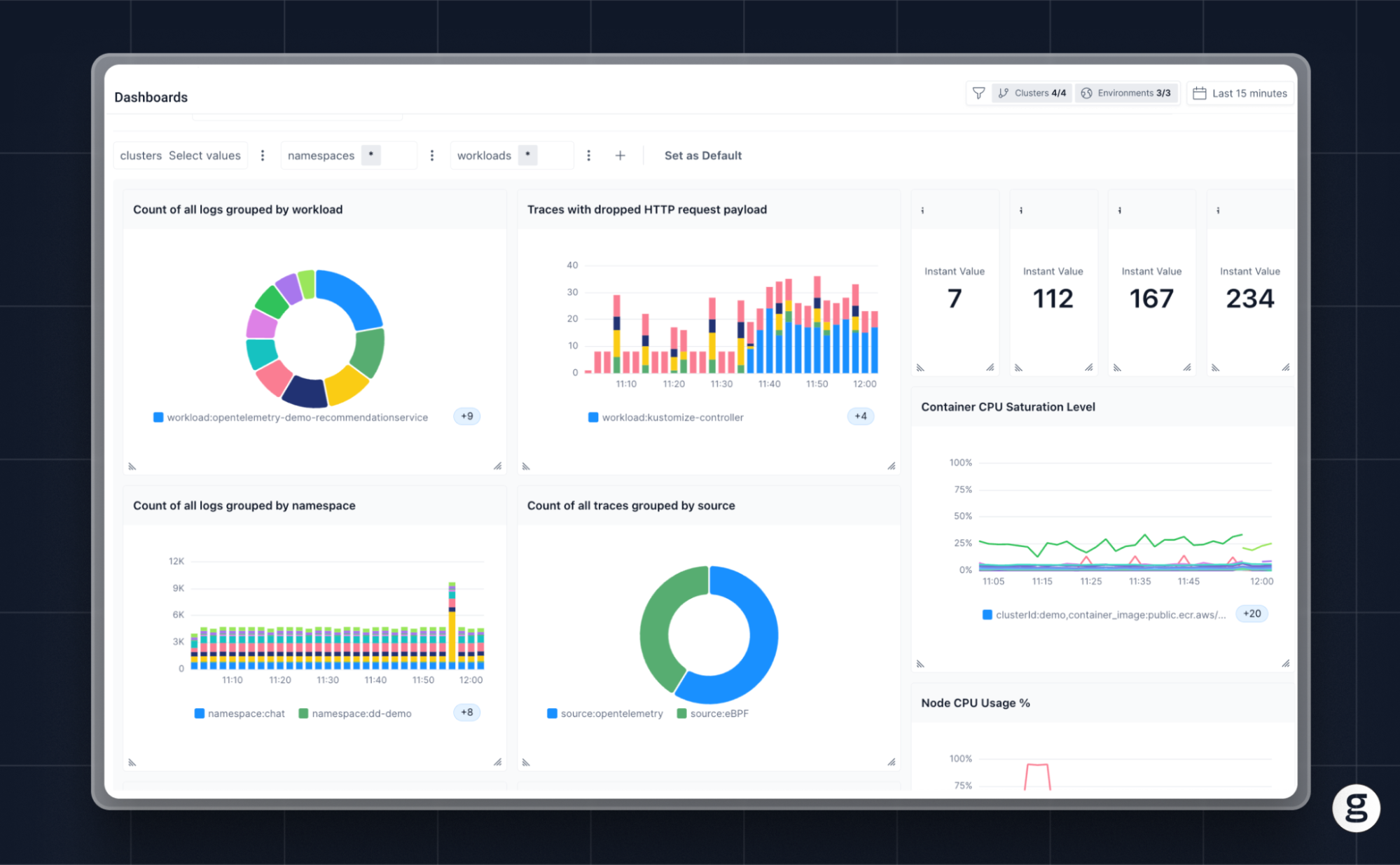
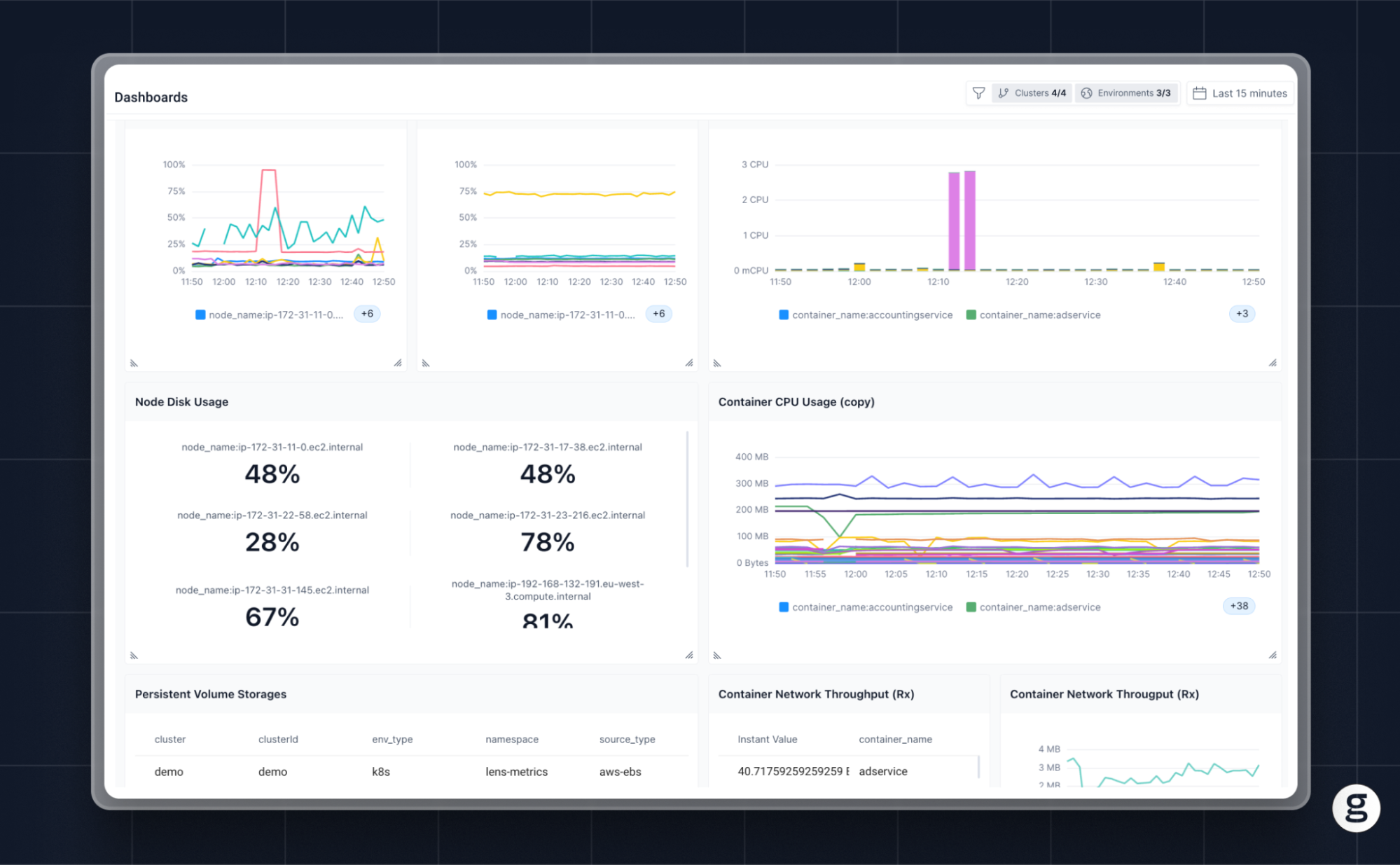
The final key piece of the puzzle is visualization software that can ingest telemetry data collected via OpenTelemetry and use it to generate charts or graphs. Popular OpenTelemetry-compatible open source visualization software includes Grafana and Kibana. In addition, many proprietary observability platforms provide built-in visualization features that can generate charts or graphs based on observability data stored in the platform.
Benefits of OpenTelemetry visualization
By consolidating complex, large-scale data collections into graphical displays, Visualizations in OpenTelemetry provide several key benefits for monitoring and observability use cases:
- Accelerated troubleshooting: Visualizations often help teams hone in on anomalies, as well as identify problematic patterns (like an application whose CPU utilization is steadily increasing over time). In this way, they make it easier to detect and troubleshoot problems.
- Comprehensive insights: By displaying multiple types of telemetry data in a single chart or graph, visualizations offer a comprehensive look at information that would often be challenging to analyze holistically when it exists in textual form alone.
- Improved decision-making: Visualizations provide additional context that can improve the decision-making process. For example, they might help teams recognize application performance trends that are not obvious from manual inspection of logs or metrics.
- Enhanced team collaboration: Visualizations are a resource that all engineers can access and use in the same way. In this respect, they help drive healthy collaboration. Working with text-based OpenTelemetry data can be more challenging because on most teams, not everyone possesses the same level of skill when it comes to tasks like manual analysis of log files.
The challenges and limitations of OpenTelemetry visualization
While visualizations are an important resource for helping to get more from OpenTelemetry, they have their limitations. In most cases, teams shouldn’t attempt to understand telemetry data using visualizations alone; instead, they should employ visualizations as one component of a broader analytics strategy that also includes text-based data filtering, sampling, and searches.
The following are key reasons why visualizations aren’t usually enough on their own to enable effective interpretation of telemetry data.
High learning curve
Although it’s relatively easy to import data into a tool like Grafana and begin generating visualizations using preconfigured settings, it is challenging to learn to produce highly insightful and accurate graphs and charts. For this reason, less experienced engineers are not likely to get as much value out of Visualizations in OpenTelemetry, at least in the short term.
Data overload
Visualizations are an effective way to help summarize large quantities of data in a manner that humans can quickly digest, but there are limits to how much data you can effectively visualize. If you have too much data to display, or too many discrete types of data, a single visualization based on all of it might end up being so confusing that no one can derive meaningful insights from it.
Visualizations can therefore be challenging to use when teams have large quantities of data, or unusually complex data sets.
Added complexity
Because OpenTelemetry itself only collects telemetry data and offers no visualization capabilities, creating visualizations requires the use of integrations that add complexity to a team’s set of observability tools and processes. This complexity is worth the hassle if it translates to meaningful insights, but again, there is a risk of creating ineffective visualizations that take significant time and effort to generate but that produce little value.
Best practices for OpenTelemetry visualizations
To get the most from visualizations as part of a monitoring and observability strategy based on OpenTelemetry, consider the following best practices:
- Establish clear visualization goals: Your objective shouldn’t be to visualize data just for the sake of creating pretty charts or graphs; instead, your strategy should be rooted in a clear set of goals that describe which types of insights you want to create using visualizations.
- Create simple visualizations: As a rule, visualizations in OpenTelemetry (and in general) are more effective when they err on the side of simplicity. Rather than trying to cram lots of different types of data into a single graph, which could make it confusing, consider breaking it out into multiple, simpler graphs.
- Create diverse visualizations: Different types of visualizations lend themselves to different types of data, as well as different interpretation techniques among varying individuals. For this reason, it’s a best practice in most cases to create diverse sets of visualizations. For example, don’t only generate time-series graphs; you might want to create pie charts or bar graphs as well.
- Update visualizations in real time: Whenever possible, configure visualization tools so that they update displays in real time as data changes. This ensures that your team is always looking at the most relevant, up-to-date information.
- Explore historical visualizations: At the same time, however, retain the ability to visualize historical data so that engineers can look back at how performance trends or anomalies have changed over time.
Use cases for visualizations in OpenTelemetry
When used effectively, OpenTelemetry visualizations can support several key use cases for IT organizations, such as the following.
Improving application performance monitoring
Tracking and understanding the performance of applications can be challenging, especially in highly complex, cloud-native environments. Visualizations based on OpenTelemetry can simplify the process by allowing teams to interpret OpenTelemetry data in a format that is easily digestible. The result, in many cases, is an enhanced ability to discover and interpret application performance issues.
Enhancing DevOps processes
OpenTelemetry visualizations can simplify DevOps – which aims to enable a consistent, unified approach to software development and IT operations – by providing a single source of truth that all stakeholders can use to monitor and assess performance.
For instance, the same chart that developers use to test an application’s performance prior to deployment could also track performance for the IT operations team once the app is in production. This way, both sets of stakeholders – developers and ITOps engineers – can work from the same, shared vantage point, enabling the type of collaboration that is central to DevOps.
Supporting cloud-native environments
The inherent complexity of cloud-native platforms and environments like Kubernetes makes it critical to have as many resources at your disposal as possible to cut through the noise and discover relevant insights. Visualizations are a key asset in this respect because they help to present complex sets of telemetry data in a form that humans can interpret easily.
Choosing the right OpenTelemetry visualization tool
As we mentioned, there are a variety of tools that support OpenTelemetry visualization – some of which are open source, and others of which are paid commercial products. To decide which option is best for you, consider:
- Supported data types: OpenTelemetry can collect multiple types of data – namely logs, metrics, and trace data – but not all visualization tools can generate graphical displays based on all data types. Some may support only logs and metrics but not distributed tracing data, for instance, while others may only work with logs that are formatted in a particular way. Be sure your tool can work with whichever types of data you want to visualize.
- Integration model: Some observability platforms offer built-in OpenTelemetry visualization capabilities, which means you can use the same platform for collecting and visualizing data. Others require integration between disparate tools, which can add complexity to your stack.
- Visualization customizability: The extent to which you can customize visualizations varies between tools. Some tools don’t offer certain types of visualizations at all; for instance, some may limit you only to time-series graphs. Some are also more restrictive in how you can customize the way data is displayed, or which data you filter out.
- Support for historical data: If the ability to explore historical telemetry data in visual form is important for your intended use cases, be sure to choose a solution that can do this in addition to creating displays based on real-time data streams.
OpenTelemetry visualization with groundcover
If you’re looking for an OpenTelemetry visualization tool that is flexible, highly customizable, and easy to use, we think you’ll be fond of groundcover. Groundcover offers an all-in-one solution for collecting observability data via OpenTelemetry and eBPF, and then displaying it using built-in Grafana dashboards. This means you can create visualizations with minimal effort, and without having to deploy Grafana as a separate tool (although if you want to use a self-hosted Grafana instance, we support that, too).
In short, groundcover gives you the flexibility of open source visualizations based on OpenTelemetry, without the hassle of having to create an OpenTelemetry visualization solution from scratch.
Pictures worth one thousand logs, metrics, and trace data
You could use OpenTelemetry to standardize monitoring and observability without the help of visualizations. But we strongly suspect you’d struggle to make sense of all of your telemetry data efficiently using that approach.
Instead, most teams should take advantage of visualizations as a means of bringing clarity to the vast reams of data OpenTelemetry generates, making it easier to bridge the gap separating data from action.
Sign up for Updates
Keep up with all things cloud-native observability.
We care about data. Check out our privacy policy.


.svg)